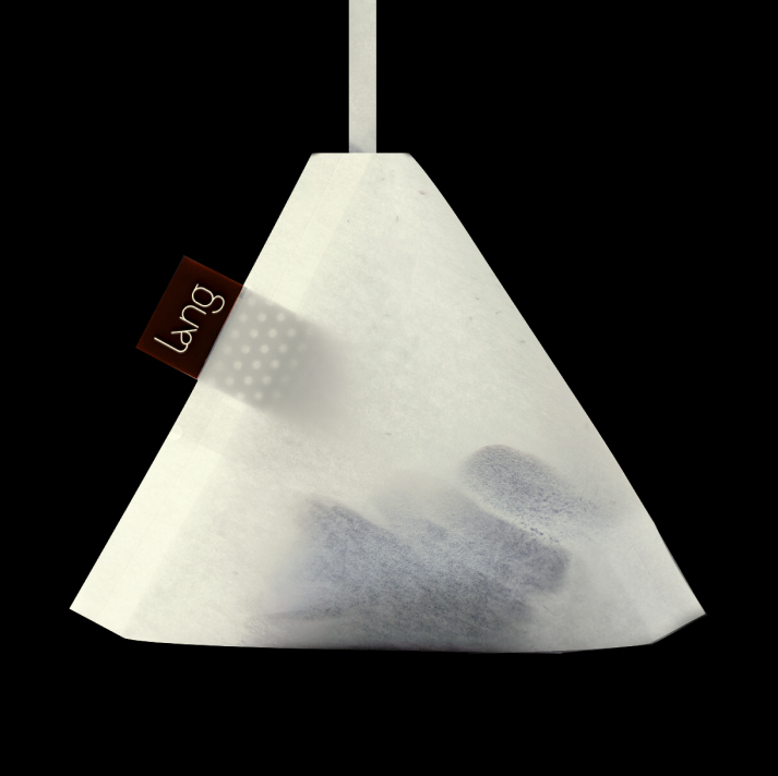
Lang carries multiple meanings in Vietnamese, it can refer to a small village or evoke a sense of calm and well-being. At Lang Spa, we embrace both, creating a space that nurtures relaxation while fostering a sense of community.
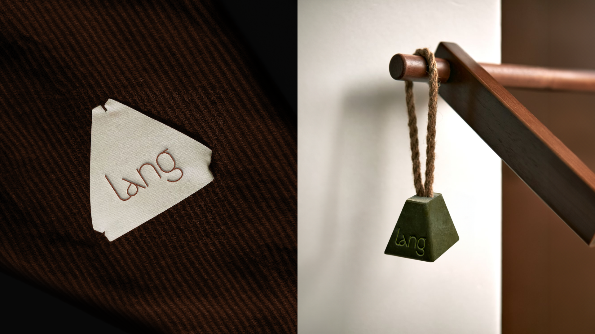
Our scope of work included both branding and spatial design, starting with the visual identity. The logo features a stylised letter ‘a’ inspired by the triangular pouches once used by traditional herbal doctors (Thầy Lang).
This subtle reference to Vietnamese healing culture reinforces the spa’s focus on care and well-being.